
Root Pretty was offering 15% off of their entire website at the beginning of October in honor of Root’s fourth birthday. I had had my eye on their gorgeous selection of pressed eye shadows for a while, so I decided to take the plunge and order a few basic colors in attempt to replace some of my favorite eye shadows with not-so-nice ingredients.

My eye shadow collection is the one area of my make up collection that still needs some love in regards to having natural ingredients. I have tried a couple of all natural eye shadow palettes but was never impressed by the performance of the shadows which led me to the decision to try my luck at using all natural pressed single eye shadows.
Root Pretty is based out of Iowa. They are a 100% cruelty free company and source most of their supplies from within the U.S., and produce all of their products in the U.S. The founder of the all natural brand, Krista, began making all natural beauty products out of her own home as a hobby and launched Root Pretty back in 2013. Not only does Root Pretty offer beauty products with quality performance and quality ingredients, Root strives to keep their products at affordable and reasonable prices for their customers.
I love everything about Root Pretty’s story and background which makes me even more excited to share them on my blog today!♥

The top left color is ‘Heidi”, next to it is ‘Cleo’, ‘Vienna is on the far right, ‘St. Tropez’ is closest to the bottom, and ‘Stella’ is directly under ‘Heidi’
So far I am really impressed with the performance of these all natural eye shadows. They deliver a great amount of pigmented color and diffuse beautifully when blended.

The thing about Root’s pressed shadows that sets them apart from other all natural pressed eye shadows that I have tried, is how well the color intensity lasts. In my experience with natural eye shadows, loose shadows always provide a ton of pigment that lasts all day – pressed shadows on the other hand, haven’t always held up in terms of color intensity for me. & Honestly, there is just something so pleasantly conveinent about a pressed eye shadow.

Swatches from left to right: Cleo, Heidi, Stella, Vienna, St. Tropez
‘Cleo’ is my absolute favorite of the bunch. It is such a unique color. It is a yellow gold with strong hints of green.


Although Cleo is kind of an ‘out there’ color, I still found it to be very wearable. When the eyes are open it looks like a basic cool toned gold but when the eyes are closed, gorgeous green hues shine through.


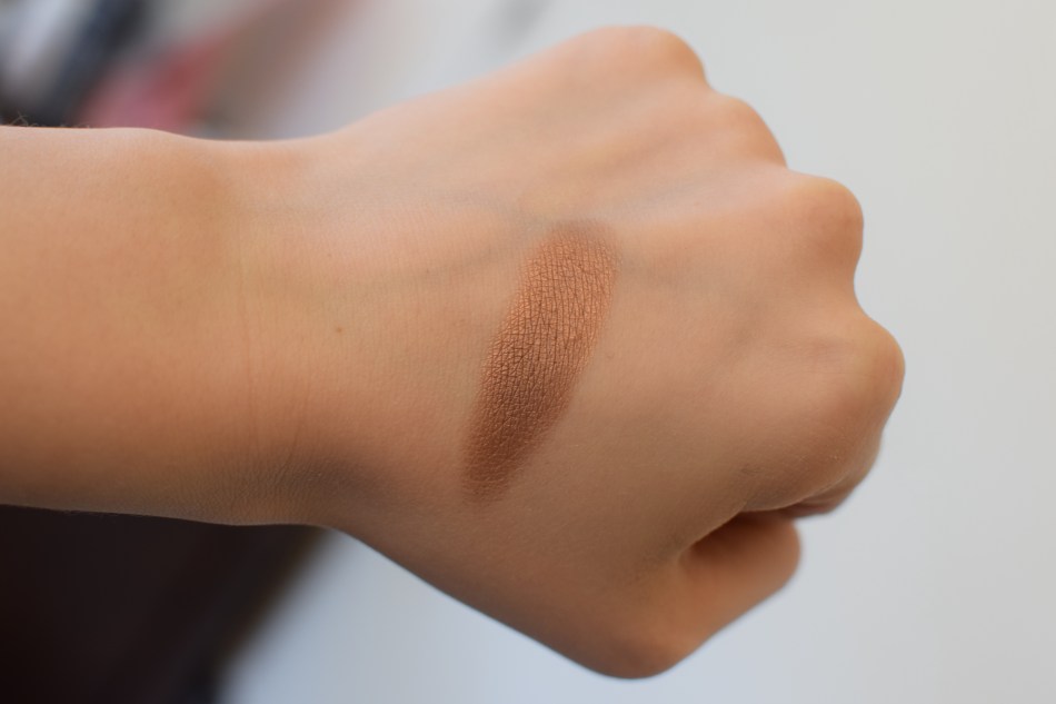
‘Heidi’ is the perfect copper color. It reminds me a lot of the shade ‘Copper’ from the Tartlette In Bloom Palette.


I love using copper colors like this on their own all over the lid and in the crease.


‘Stella’ is the perfect toasty and shimmery pink.

For some reason, I had a hard time getting the swatch of this color to show up true to color. In the photo above, the color looks just a bit warmer than it did in person.
‘Stella’ reminds me of the shade ‘Toasted’ from the Urban Decay Naked Pallete (I was so obsessed with that color for like two years strait). ‘Toasted’ is just a little bit deeper and warmer than ‘Stella’.


Lastly, I have ‘Vienna’ and ‘St. Tropez’ to share some thoughts on.
These colors are so similar.
 ‘Vienna’ is swatched on the left and ‘St. Tropez’ is swatched on the right. In person ‘Vienna’ and ‘St. Tropez’ swatched with more purple tones coming through.
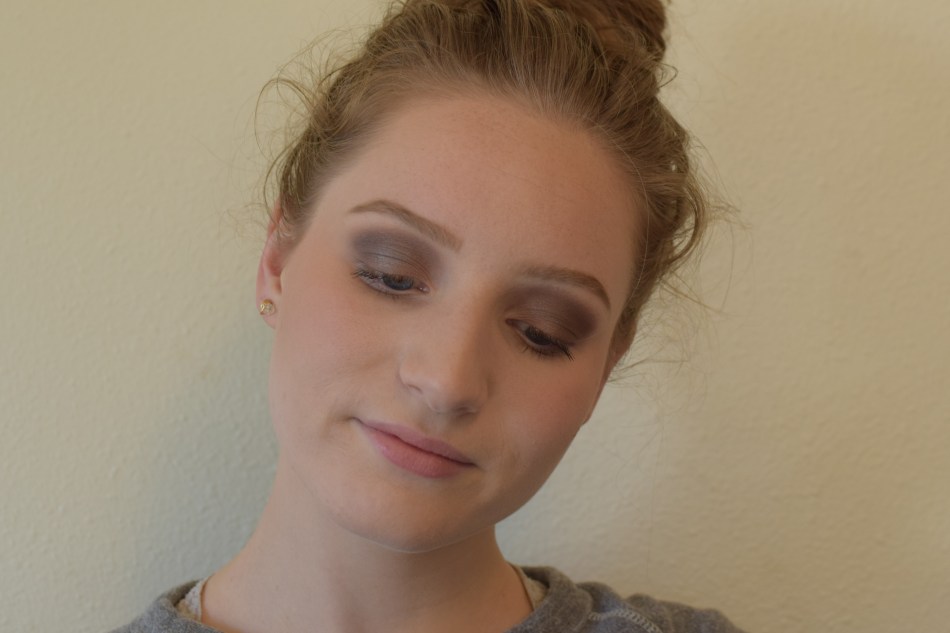
Below ‘Vienna’ is pictured on the eyes.

Below ‘St. Tropez’ is pictured on the eyes.


As I said before (and as the pictures show), ‘Vienna’ and ‘St. Tropez’ are very similar shades. The best way that I can describe the difference between the two shades is that ‘Vienna’ pulls a bit more purple than ‘St. Tropez’ and that ‘Vienna’ is a deeper color whereas ‘St. Tropez’ is more of an ashy brown with hints of purple. Both shades appear much more purple on the eyes than they do in the pans. When I ordered ‘Vienna’ and ‘St. Tropez’ I expected them to be more brown shades than purple, but I’ve actually really been liking the purple hues in both of these colors.

(Again, ‘Vienna’ on the left and ‘St. Tropez’ on the right)
Thank you for reading!
What are your favorite Root Pretty shades? Also, feel free to leave links in the comments to any other blog posts that feature some Root Pretty eye shadows, I would love to read other bloggers’ insights on some Root shades♦
I think I like Stella and Vienna. Bring them over for me to try. ❤️
I will!
Big fan of Lotus365 and getting the APK download sorted me out proper. No issues, easy installation, and straight into the action. Get yours right here!: lotus365 apk download
YOLO betting, eh? Live a little, why not? Give it a go and have a flutter. You only live once! Learn more about yolo betting here.
Been playing the 9k boss game on this site for a while now. The graphics are sick, and the gameplay is addicting. Good selection of games too. I found my new go-to spot! Find more: 9k boss game